I'm Eli.


|
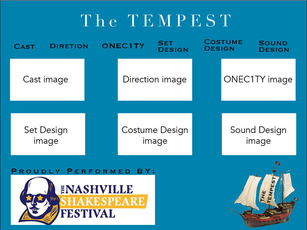
When creating both the logo and homepage design for The Tempest archive there was one main thing I kept in mind, simplicity. After looking at many archives, some effective and some less effective, what I discovered is the effective ones are generally quite simplistic in their nature. I first applied this concept to my logo design by including one major plot point from the play along with text stating the plays name. Since a boat is involved as a large plot point in The Tempest this would make the perfect background for my logo that I could then overlay text on top of. I choose to rotate the text onto the sail of the boat merely because I liked the visual aesthetic of it. As for the homepage of the archive I also wanted it to have a simple look and feel so that it was not difficult to navigate. I chose to use a lot of repetition on my homepage. Not only is there a tab for each specific section of the archive but there is also an image for each section. If the image is clicked then an internal site link will take you to the same page the menu bar at the top would take you to. I aligned all elements of the homepage in a very linear way. By this I mean almost all elements are not stand alone but they have other elements that are often aligned with them horizontally. This alignment helps create an ease of use for the viewer. All elements on the homage are sized decently large so that there is not a lot of blank space, I did however try to make sure no element was right next to the margin of the page so that the background color could be seen all the way around the homepage to help contrast with the other elements. Finally I did make a reference to the Nashville Shakespeare festival with their logo at the bottom of the homepage since a large audience viewing the site may already be involved with the festival or may hope to get involved.
0 Comments
Leave a Reply. |
AuthorWrite something about yourself. No need to be fancy, just an overview. ArchivesCategories |
||
 RSS Feed
