I'm Eli.


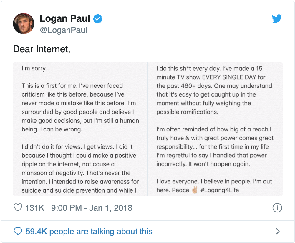 Logan Paul is a very famous youtube vlogger. He currently has 20 million subscribers and this number will continue to grow; however, there was a time when Logan pushed the envelope of intriguing content a little too far and it got him harsh criticism from many. Since Logan is a vlogger with such an extensive audience his content is seen and analyzed by so many people he must be thoughtful in what he posts so that he can both continue to attract new viewers but also not outrage people for using poor judgment concerning his content. In 2018 Logan posted a video in which he showed a dead body hanging from a tree in a Japanese forest. This post brought a lot of negativity not only to Logan’s channel but also to himself personally. As many argued, this was a poor use of Paul’s extensive viewership and audience. Logan claims he was actually filming the video “to raise awareness for suicide and suicide prevention” but he wound up showing a graphic and gory image of a dead body from a tree. The forest Logan was filming in has been known for a decade to be a place where suicide victims go when intending to take their life and due to that context Logan had no claim when saying he was surprising and just in shock upon finding the body. Due to this context and the massive extent of Logan’s audience he needed to have a hard life lesson and receive some of the public backlash. YouTube is an interesting form of digital media, it is very different from film or TV. Content on YouTube is much more direct from the creator to the viewer in a much quicker turn around time, all of these factors mean that there are far less clues that tell a viewer what will happen in a YouTube video until it is watched. Movies and TV shows both have ratings that clue audiences into some of their content that could be underside and thus avoided by viewers. Since YouTube content is much less regulated it is the responsibility of every creator to police themselves and make sure they are not crossing the line when posting content that could be considered insensitive. I compare this instance of public shaming to chapter 6 in So You’ve Been Publicly Shamed because these two instances are very different. In this chapter a woman gets a man shamed and ultimately fired from his job because of one joke. In this instance the punishment given brought upon the man was harsher than he deserved. All the woman needed to do was call him out on it to his face, she did not have to take his picture and post it on twitter. As mentioned earlier, Logan Paul did make a mistake when posting content that showed a dead body, it is because of this that I think the punishment needed to be brought to him is exactly the one he got. A large public backlash not only made him remember his large audience that he must be aware of, but it also showed that Logan as well as all other Youtubers must still have a filter concerning their content.
3 Comments
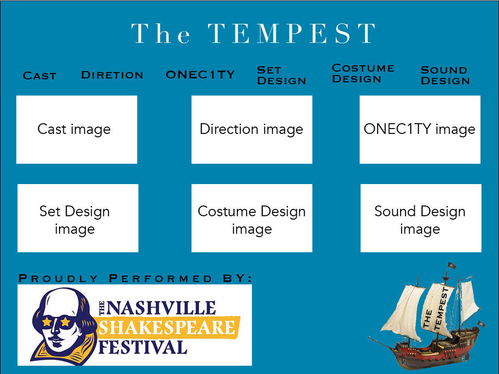
When creating both the logo and homepage design for The Tempest archive there was one main thing I kept in mind, simplicity. After looking at many archives, some effective and some less effective, what I discovered is the effective ones are generally quite simplistic in their nature. I first applied this concept to my logo design by including one major plot point from the play along with text stating the plays name. Since a boat is involved as a large plot point in The Tempest this would make the perfect background for my logo that I could then overlay text on top of. I choose to rotate the text onto the sail of the boat merely because I liked the visual aesthetic of it. As for the homepage of the archive I also wanted it to have a simple look and feel so that it was not difficult to navigate. I chose to use a lot of repetition on my homepage. Not only is there a tab for each specific section of the archive but there is also an image for each section. If the image is clicked then an internal site link will take you to the same page the menu bar at the top would take you to. I aligned all elements of the homepage in a very linear way. By this I mean almost all elements are not stand alone but they have other elements that are often aligned with them horizontally. This alignment helps create an ease of use for the viewer. All elements on the homage are sized decently large so that there is not a lot of blank space, I did however try to make sure no element was right next to the margin of the page so that the background color could be seen all the way around the homepage to help contrast with the other elements. Finally I did make a reference to the Nashville Shakespeare festival with their logo at the bottom of the homepage since a large audience viewing the site may already be involved with the festival or may hope to get involved.
For my introductory website I created a site where someone who knew nothing about me could learn more about some of my interests as well as a few other things I enjoy. I created this site primarily based off of a template I found. I used an online template for the opening homepage of my site. I also utilized my tutorial website as the internal linked pages, however I did heavily alter those. The process of creating this site was both difficult and frustrating at times. I came into this course with practically no prior experience coding or working with html or css. I learned a lot from looking at other websites and using the develop tab in safari to understand how the sites I liked were coded. My final product site came about from hours of looking at other code for examples and playing with my code to find how I could positively alter it to make it more resemble the site I had planned out in my head. I had very initial high hopes for my website but very quickly realized that my dreams for my site were not going to come true. I hoped for something that was both very simple but also very visually appealing at the same time. I believe my site did achieve a simplistic look and feel but it lacks what I was envisioning when it comes to the look of it. I am pretty happy with how my three internal pages look but my homepage is what I would have liked to be more visually appealing. If I had more time, and experience coding I would want my homepage to look more modern and sleek in its visual design. The modes I utilized when creating my site were both visual and linguistic. I not only had a simple design as I previously discussed but I also wrote the text elements on my site in a way that was very introductory. What I mean by this is someone who has never met me before could open my site and learn about me without any prior knowledge. You would not have to be a close friend of mine to understand what I am talking about within my textual elements. The visual mode of my site is created not only through the design of the site but also through the images on my site. All of the images on my site have a specific purpose wether that be complementing something presented in one of the sections of text or just to give the viewer some added context as to what I was describing. On each of my internal linked pages I had three images, all of which often correlated directly to the text on the page. My largest design strategy in this introductory website was being simplistic and straightforward. I did not want a viewer to open the site and be overwhelmed with an excessive amount of information in either text or images for that matter. Many sites I looked at prior to creating my own seemed to overwhelm the viewer very quickly. The more information included on the site not only made it overbearing but often times made it difficult to navigate as well. My primary design goal when creating my site was to avoid this by making a simple yet effective site.
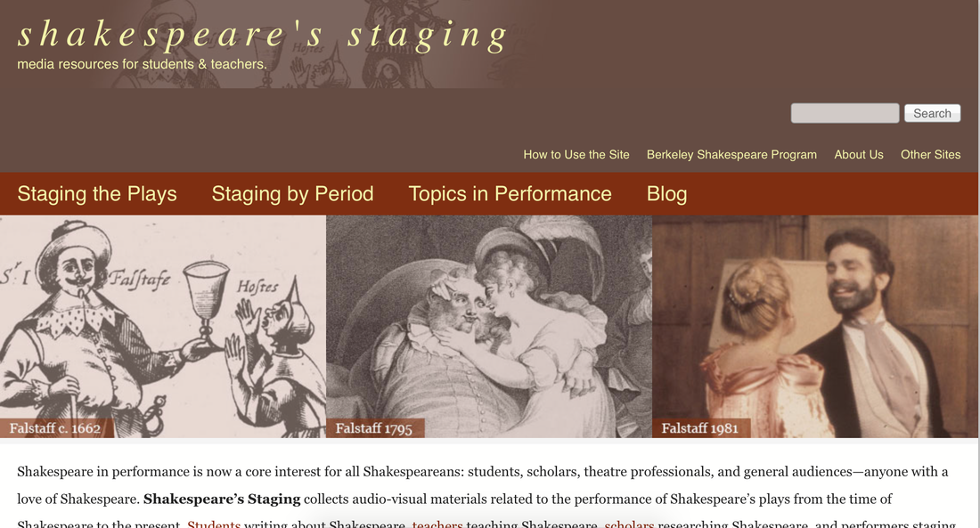 I am analyzing the site titled shakespeare’s staging found at http://shakespearestaging.berkeley.edu. On this site there is a variety of information concerning various works of Shakespeare. This site first opens to what I think is a very nice and presentable looking home screen. On this homes screen you will first see two menu bars at the top of the page along with a search bar. Below this you will see some images that help to add some visuals to the homepage and below that you will find a small text blurb helping the user of the site figure our what the intended purpose of the site is. Finally under this there are a few more series of links at the bottom of the homepage. For starters I really like this homepage of the berkeley site not only because I think it is well organized but also because I think its purpose is well stated. When someone who knows very little about Shakespeare, such as myself, opens the site, they will instantly know what materials they will find on the site after reading the short text blurb on the homepage. The text says “Shakespeare’s Staging collects audio-visual materials related to the performance of Shakespeare’s plays from the time of Shakespeare to the present.” This is a very clear and concise way to tell the purpose of the berkeley site. The audience of this site could be several people with varying amounts of previous knowledge concerning the works of Shakespeare. The site may attract someone who knows lots about many of Shakespeares works but desires to find more images of a play they have never seen before. On the other end of the spectrum this site may also attract a very new and uninformed viewer just looking to read an overview of one of Shakespeare works. While there are many things this site does very effectively, one thing it could do better at is giving more context. No where on the site can I find just an overview of Shakespeare, or his life. All the work is very specific to his written works from what I can see. It would be very helpful for someone such as myself who knows practically nothing about Shakespeare to be able to learn a little more about his life, and the time period in which he lived in before jumping straight into one of his written works. This would help the viewer to better understand the writing style Shakespeare used that is obviously very foreign to many people in todays society. Finally one thing that the berkeley site seemed to do a very good job at was providing many audio visual elements of the works just as they said on there homepage. This is very useful for a Shakespeare archive and is an element that I would also like to include in our own archive. Since the writing style of Shakespeare can be very difficult for many to understand, these visual elements provide the viewer of the archive with a break from solely written material.
|
AuthorWrite something about yourself. No need to be fancy, just an overview. ArchivesCategories |
||||
 RSS Feed
